Have you had it too?
As you know I’ve been working on my master bedroom.


Last year around this time I tried to love my blah master bedroom more by bringing in shades of the sea during the Color My World Challenge.

It was fun to try freezer paper stenciling, create tracing paper and tissue paper canvas art and bring in some soft aqua blues with bedding and accessories in the bedroom and adjoining bath, but the overall feeling of the room was meh. hmmm. ho hum. blah.
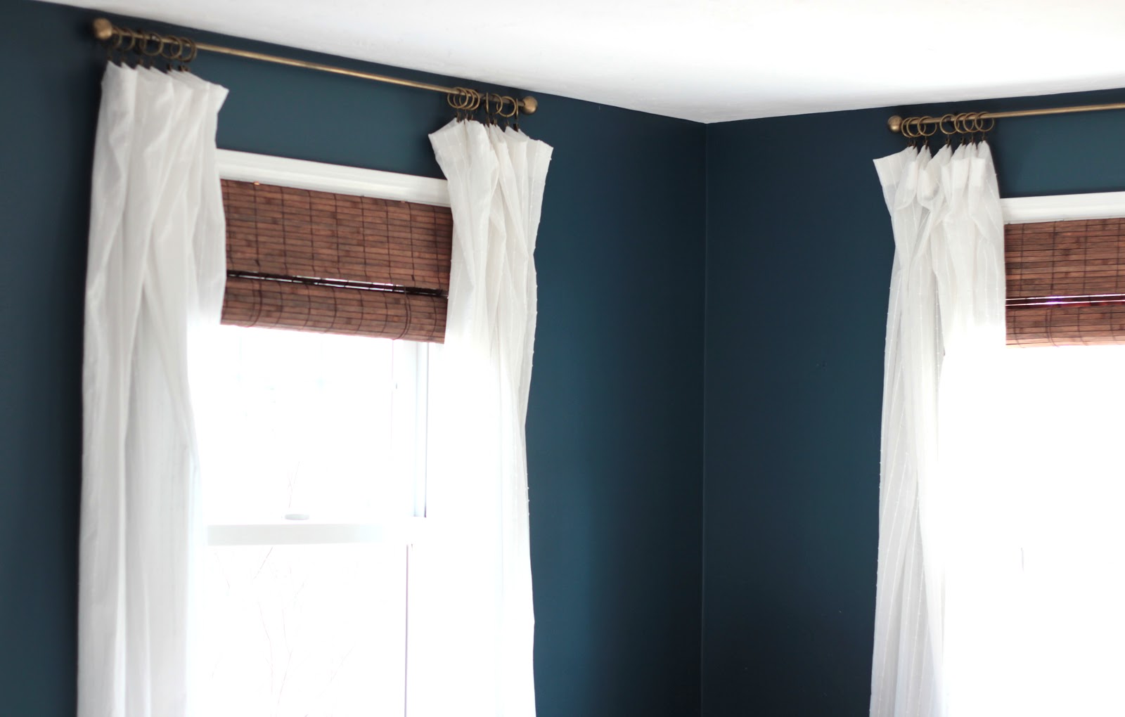
In our last house we had a chocolate brown master bedroom and loved it. It was like a cozy cave and that room just felt GOOD to be in. Okay – so we deduce that dark in the master makes us happy. But we were over the brown. And I have been thinking a lot about warm and cool together. In particular – charcoal grey or black with wood tones. Brown leather with navy.
ooooooooh. yesssssss.


After hemming and hawing and painting 47,937 samples on my wall, my good friend Jenny of Evolution of Style recommended the greeny blue navy, BM Gentleman’s Gray (#2062-20) that she had used in her powder room.
And just like I KNEW when I opened that Clarksville Gray that it wasn’t the one, the instant I opened the can of Gentleman’s Gray (that has not a shred of gray in it, by the way), I knew. We were meant for each other.
No matter how many times I paint various rooms, it’s truly amazing to me how a color can affect your mood and influence the feeling you get when you are in a space. And to me, repainting a space is worth the painful waste of choosing the wrong color if you find a color that speaks to you.
Funny thing? A couple of weeks after I painted the room, we went on our dream vacation with our munchkins to Hawaii and were surrounded by the most beautiful greeny blue waters.


Oh the drama!!
Changing the wall color has inspired me to bring the rest of the room together. So here goes….the to-do list for the master bedroom. I’m posting a list right here to make myself accountable.
So tell me, have you ever had painter’s remorse??


Cassie @ Primitive & Proper says
oh man have i had it! YES! and you know what, i just pretended to like the color rather than admit it was horrible because i am stubborn like that. 🙂 now i know not to bother painting it entirely unless my gut says a big fat yes!
LOVE your new color!
Kathy C. says
I completely know what you mean!! I'm about to repaint our master bedroom walls too. My husband painted it while I was out…so I wasn't around to stop him when he started… it looks like flesh. lol. I messed up!! But for now, it's not too overpowering since we have art up on the walls. I painted our family room a dark deep blue that I had the opposite reaction to. I love it! And it's incredibly calming!
Jenny says
Aw, thanks for the shout out Lisa! I had to laugh, because I had the same reaction when I opened the can of Gentleman's Gray – I just KNEW it was the right one! I adore it in your master bedroom! It looks like the perfect place to cozy up for a good night's sleep or an afternoon nap on a gray, rainy day (like today!). 🙂
Linda {Calling it Home} says
Yes, I have had it. Now, I no longer try to live with it because I know I will still hate it. I just suck it up, and paint immediately over it. Paint is really bad when you get it wrong for you, but mood altering when it is right. Good for you that you kept at it, and now love it.
Lobster Meets Peach says
I just love the color! Glad you went with a bold choose. Sometimes I feel like Pintrest makes me second guess myself since all rooms seem to be white, white and more white. But then I remind myself that white walls are so not me. Best to repaint and have a home that is true to you!!!
Anonymous says
When I was pregnant with my first child I left it to my husband to paint the office. I returned home to find streaky Kool-Aid red walls. Not only was the color awful, I was also remorseful for letting my husband be the one to paint them. 😉
-Rebecca
NanaDiana says
Oh-several times, Lisa! I have painted and, like you, knew from the moment that I threw up the first swath of paint that I should quit right there. The worst was painting a girl's room the color she picked out…Called raspberry dream…it was more like
berry puke! AWFUL…felt like I was imprisoned in a jar of jelly and couldn't get out- xo Diana
Calypso In The Country says
I love the new color! I have had painter's remorse many times. In fact, I still have to repaint my kids bathroom!
-Shelley
Dana Frieling says
It's obvious you're not alone! I painted my entire house the wrong color when we first moved in b/c I wasn't secure enough to follow my gut. It lasted 3 years then I promised to repaint the entire house myself to save money. It HAD to go! Your bedroom is GORGEOUS.
pam {simple details} says
I've been there, too! Love the color you chose, it looks just like your moody inspiration photos! I was noticing the coordinating colors mother nature paired with it in your Hawaii pics ~ very pretty!
Val says
I have painters remorse almost every time I paint a room…I live with it for awhile and the entire time I think I should have picked the other color. Ugh, LOL
Mary Ann at classic•casual•home says
LOVING IT. I once painted our bedroom a horrific shade of bubble gum pink…instant remorse on that one. It was about 25 years ago …still a nightmare.
Tiffany says
Ugh, too many times. We painted our bedroom a few months ago and I HATE the color. I knew as well. It's supposed to be a gray color but looks baby blue. I usually paint a swatch but was in a hurry so it's my own fault. Our room is on hold until I figure out another color. I feel like we sleep in a little boys room.
I'm definitely with you on warm and cool colors together.
Mandi@TidbitsfromtheTremaynes says
I can't believe how absurdly excited I am about someone else's master bedroom makeover. . . I want to help and get all up on this!
Sadly, I dont love my bedroom paint color, either. But I cant bring myself to change it because I'm cheap and I will have the craziest hardest disaster area to paint on the planet. Like, tape off five million different mouldings, take down heavy wall hangings, move the ginormous bed. . . sigh. I'll live through you. Kay?
Anonymous says
[p]The quality of our UGG Men Uggs is 100% guarantee in UGG online shop that disburdens you . An important prerequisite for modeling vigorous hateful "ugg-bailey-button-triplet" total might grab the best of people's attention, outstanding warm with comfortable as many women choice, the right to match a variety of sweet dress up snow boots, not only for you to create lovely the image is relatively the best dress up your weekend trips . Classic UGG line is very impressive and trendy and therefore has [url=http://www.uggoutletssalesuk.co.uk]ugg boots sale uk online[/url] grown extremely popular among customers . Discount Shox has been termed collectively [url=http://www.uggoutletssalesuk.co.uk]ugg boots outlet uk sale[/url] of the foremost necessary in technological breakthroughs being incorporated into footwear . If you really don't thoughts [url=http://www.uggoutletssalesuk.co.uk]cheap ugg boots uk[/url] investing more cash you'll be able to uncover jewelry watches at jewelry stores . However no one may reject the belief that these uggs shoes on sale are well [url=http://www.suggbootsclearanceuk.co.uk]ugg boots sale[/url] identified all over the world . Ugg shoes often in Australia and New Zealand, the sizing of manufacturing and development of children [url=http://www.suggbootsclearanceuk.co.uk]cheap ugg boots clearance sale[/url] and older people . The UGG bubble that be created in the rear of [url=http://www.uggoutletssalesuk.co.uk]ugg boots outlet[/url] the shoe, gives the style that people enjoy ugg boots outlet.[/p]
Urban Orchard Interiors says
Oh my friend, I have painted our living room more times than I can count. It was such a good learning experience though–I learned so much about light and color every time I experimented and failed. I love the color you chose and your inspiration images are gorgeous! Can't wait to see the transformation.
-Lane
Andrea says
Yep, I've been there before. I love the new color and I don't think you can go wrong there. Can't wait to see the room evolve.
Karen of Little Red House Designs says
This is exactly the reason I hire a decorator to come to my home to help me choose the right color paint for my rooms. She charges 75.00/hour which is LESS than I would spend on finding the right colors (Yes, BM paint adds up FAST!)
The Yellow Cape Cod says
Lisa, What a great post! I especially love what you said at the end, I completely agree that finding out what DOESN'T work is progress. 🙂 Best, Sarah
Susan Maclean says
Oh yes! here's our downstairs toilet (half-bath, I think you may call it)on my blog…. try scrolling down a couple of posts. The original colour I hated the day it was finished – TEN years of hating! and now, I am keeping the grey for ever. SO I understand completely, and that new colour – Fabulous! http://mac-adventureswithbooks.blogspot.co.uk/
Jennifer @ Dimples and Tangles says
That color is absolutely gorgeous! You're moving right along on your bedroom…I'm jealous! 🙂
bluehydrangea says
I can't believe I stumble upon your blog today of all days, I am trying to decide between several shades of blue for a small den in my house and one of those colors is Gentleman's Gray! I may have just picked the winner! Thx!
Treat your pets too says
Just had serious painters remorse in my powder room. My house has mainly gray or griege colors and the master bath I just finnished in Palladian blue cut to half strength. Loved it all until the powder room…i thought i would be different and since i had punches of coral in the family room the powder room went to coral! I spent hours looking over samples and swatches and painted some on the wall. I went with vintage coral by Behr. First wall it looked nice but by the last was hideous neon..the room has no natural light. In that room awful so it may just become something to paint furniture with. Then i rushed out to get a peachish color crisp straw by benjamin moore and neon orange! Sigh! Again probsbly be real nice it a light and bright room. Now looking at the direction of navy..which was my first intinct and am going to paint gentleman's gray what an interested color and no neon i hope! Started out thinking hale navy but gentlemans gray is winning. And going to get natural lights that might cut the horrible neon glow it turns the colors in there. My colors are currently BM abalone-guest room lavender gray and quite serene. BM edgecomb gray living room, loft and halls of open concept home, BM revere pewter- office, BM 1/2 cut Palladian blue master bath. BM Azure water-daughters room-very pretty sophisticated teal. Looks great with woods and white. Family room- BM jute (nice but not a slam dunk) with silhouette acent wall(love similar to kendall charcoal) Still to do..daughter bath-likely a lavender white?, master bedroom- still thinking looking at SW collanade grey but i have a lot of easy greys already so not quite enough difference room to room with the grey. and possibly do something with the laundry room maybe a old white with bright trim…though staying away from coral on walls!
Cori says
@Treat your pets too This is hilarious. I just picked Palladian Blue for our master bedroom, which is a perfect colour for that room because of all the natural light.
The reason I came on this blog is because I accidentally picked antique white for our trim. I mixed up SW Antique White and BM Antique White. Ahhhh! I now have beautiful edgecomb grey-like walls in my living room, a light pewter ceiling… and a peachy pinky trim. Sometimes I tell myself I’ll live with it– mostly because my future FIL painted the trim for me and I can’t imagine going over the hours he spent painting it. I might just have to suck it up and paint over it by myself. The room is empty, so I’d rather do it before we put the furniture in.
[email protected] says
Cori I feel your pain on the trim that is not the right color. I have been there so many times with paint colors that were not right. I’d paint the trim now instead of waiting because chances are the trim color isn’t going to grow on you! BM White Dove is really pretty with Edgecomb Gray (I have it in my dining room) and Decorator’s White is a bright white that is really pretty with it too!
Jodee James says
Chiming in with my vast experience in using BM Clarksville grey in our past three homes. It works beautifully on a a feature wall in a big bright bright space (southern exposure with diffused white window dressings) as in the former two of our homes homes, but tanked big-time when painted on all four walls (west and north exposure windows) in our latest master bedroom. In the latter, it looks like unappealing old pea soup. Lesson learnt, always take into account the direction of the light and the size of the room! 🙂
Lisa says
Jodee you are so right, the natural light a room receives greatly affects a paint color!