We love to travel and have reminders in our home of places we’ve visited. I have a series of framed maps from places that are special to us (which I have to share with you soon), but ever since I saw the “City” signs at Humble Pie and Between You and Me I have been obsessed with the idea of making one.
Tara at Between You and Me has a wonderful tutorial on creating your own sign. My version is a loose interpretation of her awesomeness because our saw has been loaned out to a friend and I couldn’t wait to get it back! Also, it’s just fun to put your own personality into any project that you do.
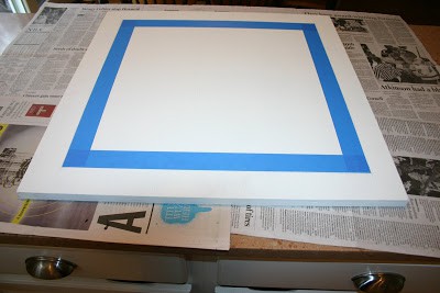
I started with an unfinished piece of poplar from Lowes that is roughly 24″x24″. I gave the smooth side, and all edges, a couple coats of primer using water-based Kilz spraypaint.
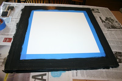
When the primer was dry I taped off the outside edge and painted a black border.
PS: that’s the last time I ever use blue tape. I don’t know why I have returned to it time and again when the paint always bleeds through. Since this project I have tried the green Frog Tape and it’s a thousand times better!
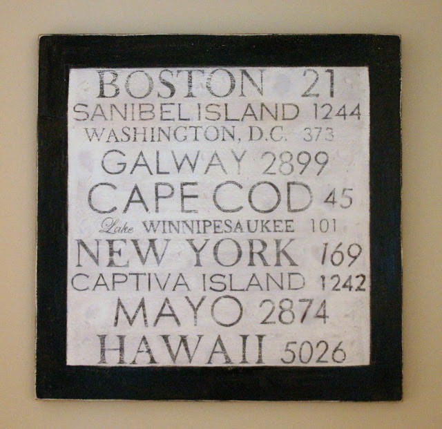
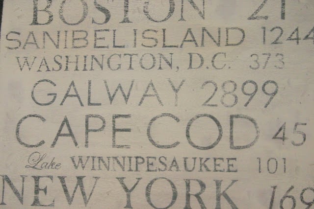
Next I looked up the distance from our house to each destination we have traveled to on the handy dandy world wide web. Check out this site – it never ceases to amaze me that pretty much anything you ever desire to know can be found on the internet! My kids loved this part – seeing how far we have traveled was really interesting (and resulted in an impromptu math lesson!)
I printed out several versions of the destinations and mileage, playing with the font and size until I had a design I liked. (I used a combination of Century Gothic, Copperplate Gothic Light and Baskerville Old Face fonts in various sizes.)
Then I used the cheapy method of stenciling:
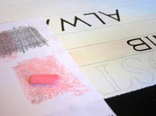
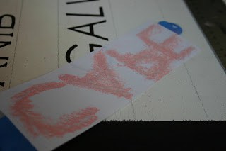
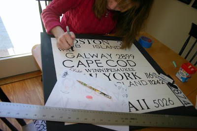
First I drew guide lines on the board. I rubbed colored chalk (thanks kiddos!) on the back of the text,
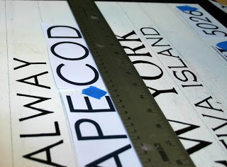
taped the paper to the board using a T-square to make sure the words were lined up properly,
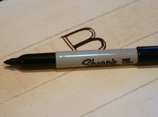
and then outlined each letter and number with a pencil. I then filled in the text with a black Sharpie – it was perfect for this project! I definitely could not have painted on the details in these fonts, and it made cleaning up the border bleed-through a breeze.
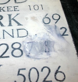
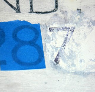
The big mistake I made was to paint over parts that I wanted to re-do. I used a paint brush and the Kilz primer, but it took several coats to cover the black Sharpie. (Some of the numbers printed out in funky spacing – see how far apart that 4 is from the 7 on the Mayo mileage? That’s how the computer spaced it. Once I stenciled it, it just did not look right. I also tried to add a couple of compasses next to Boston and New York that did not come out so well, hence the gaps between the words and numbers.)
I thought that this would be disguised with distressing but oh, was I wrong! When I re-stenciled those parts they looked so horrid! I ended up using a product called Oops, which removes paint (paint thinner or mineral spirits would work here too.)
Do you like this great big mess I created for myself?
I learned to tape over the decent stenciling to protect it while removing the excess paint.
I then sanded these areas down to bare wood, reprimed and re-stenciled. I could have avoided that mess by just sanding off the offending letters in the first place, then repriming and re-stenciling. If you make a sign, I highly recommend not painting over mistakes, just sand them off.
When the stenciling was done, I gave the whole piece a whitewash (equal parts white paint and water, mixed). This was a tip I learned from a sign-making guru. While I like this technique, in retrospect I could have skipped the white washing on this project and gone right to sanding.
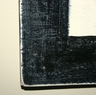
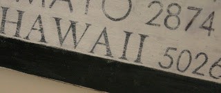
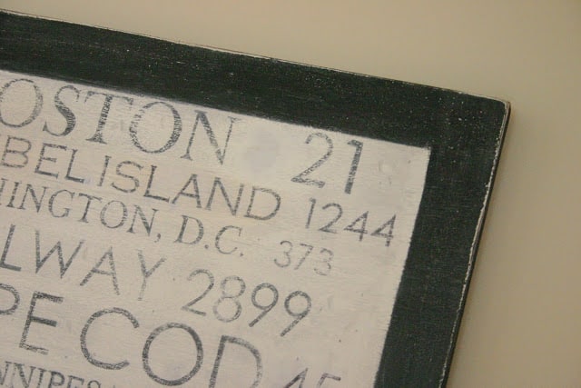
I sanded the entire sign, especially roughing up the edges. I love how the white and bare wood peek through.
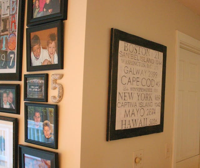
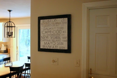
I also banged it up with a hammer and sanded some spots down to the bare wood. I love how distressing the sign gave it the feel of an old sign found in the back of a barn. We don’t have a lot of rustic pieces in our house and I really like how this juxtaposes the satin black of the frames on our kitchen gallery wall.
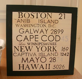
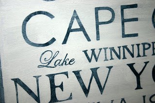
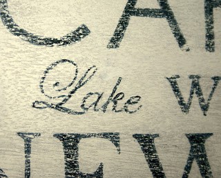
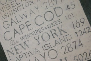
“Lake” is the only word not in caps and I think it adds a little flair to the end result.
I don’t know if you’ve noticed but I really dig black accents in a neutral environment!
Despite my learning curve, we love how the sign came out!
The new sign hangs in between our kitchen and family room, and reminds us of
places we have been fortunate to travel to
as a couple and a family,
as well as one destination we dream of going to together someday!
This piece of art is far from perfect, but I did it myself (inexpensively),
it’s a fun piece of graphic art for our new house,
and best of all, it’s meaningful to our family!
Thanks for stopping by to check it out!
Hope you’re having a great day!
I’m linking up with these fabulous blogs…..come check them out!






Kelli says
Wow Lisa is this GREAT!!! It adds so much to your home. I'm inspired 🙂
Emily says
Love it!!! Such a cute and creative idea!!
-emily
nestnestingnested.bogspot
Mandi@TidbitsfromtheTremaynes says
I think that is gorgeous!! Wish you'd make me some!
Janell @ Isabella and Max says
What an awesome project, you made it look like you picked it up at a vintage store. Enjoy! Janell
Inspired Mrs. Stevens says
this is sooo cool! I love the distress look. Me & the hubs are making this massive canvas of the places we've been to together that means something to us {cheesy I know}; here's a peek:
http://galleries.statesman.com/gallery/nook-nook-022411/#156945
now, just don't know how to make those stencil letters look distressed like yours. Do u think ur technique will work as well on canvas?
Desi says
You are so cute! I love this! I really want to do this or something similar, but we haven't been to too many places together 🙁 We really need to travel more lol! You guys have been to some interesting places 🙂 LOVE THIS!
Kristin says
lisa, i love this project! very clever and the end result is absolutely gorgeous! 😀
i'm wondering, how how did it take to trace all of the letters/numbers & then fill them all in with the sharpie?
love it!!! :D:D:D
Sally Lee by the Sea says
really, really cute! I love the idea and you made it look fantastic :O)
Anonymous says
LOVE IT —THIS IS MY FAVORITE!….behind the name poster)
Kathryn Michelle Jenkins says
this is really really cool! super impressed. great blog.
new follower,
kathryn
http://www.thedragonsfairytail.blogspot.com
Kathleen says
I love the idea of memories that are around the house, but arent just pictures.
Pictures are great, but i love this as much!
you are so talented!
Between You and Me says
I'm so impressed with your sign!!!
Thanks for sending me the link so that I could see what you did with it….
Ours is 4 ft by 4 ft and it took about 13 hours to complete….
so hard but so worth it!
love your blog~~~~
A Vintage Vine says
Lisa, that is such a great idea!! I have been wanting a new sign idea and you just gave me one!!!
Tracy says
Love this! Very unique and nostalgic looking. Thanks for sharing.
Denise at PinkPostcard. says
so cute! what a great conversation piece! you did a great job on it. love the look and especially the distressing 🙂 thanks so much for sharing this at Transformations and Treasures!
Anji Johnston says
This is so cool! You did such an amazing job!